Adg Editorial Edition
GDP per capita · 2025

Editorial content. This page contains the full editorial reading. Social media cards are separate promotional assets, shown in their own section.

Read the edition

Series · Publication day · Credits and sources

The distribution

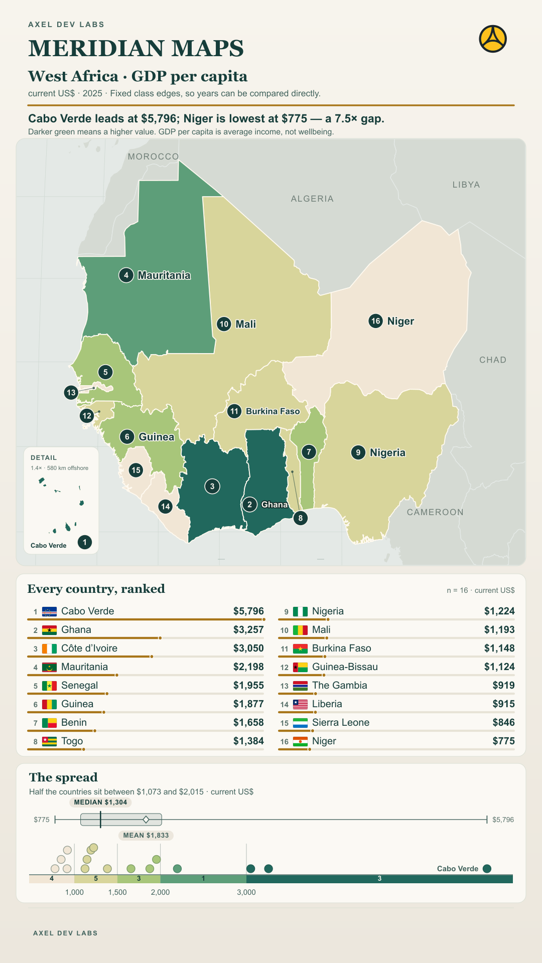
The development: Sixteen countries; the median is $1,304 and the mean is $1,833.

What the evidence says: Flags identify countries; orange marks above the regional mean and teal marks below it.

Question to watch: Which countries set the range?

Social media cards · separate promotional assets

Each link opens a social-ready card image, its platform caption and permanent post URL. These assets do not replace the editorial content above.
Adg Editorial Edition
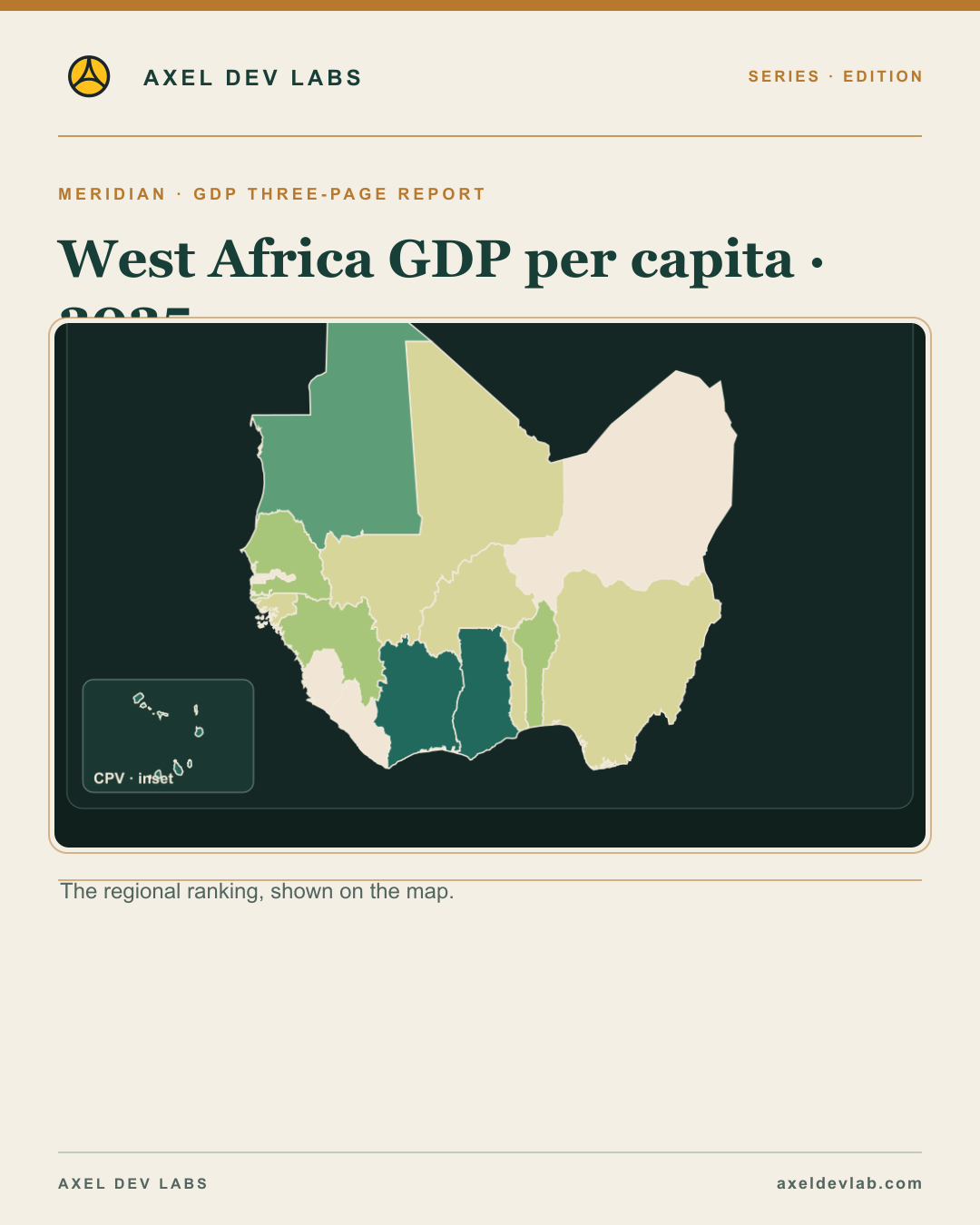
West Africa GDP per capita · 2025

Editorial content. This page contains the full editorial reading. Social media cards are separate promotional assets, shown in their own section.

Read the edition

Series · Publication day · Credits and sources

How countries compare with the regional mean

The development: current US$ · 2025 · Fixed class edges, so years can be compared directly.

What the evidence says: The median and mean answer different questions.

Question to watch: Why do the mean and median differ here?

Reading the GDP per capita map

The development: A national average cannot show income distribution within a country.

What the evidence says: Values are current US dollars per person for 2025. Fixed class edges support comparison across years; they do not measure household income or purchasing power.

Question to watch: Which country would you examine first?

GDP per capita

The development: current US$ · 2025 · Fixed class edges, so years can be compared directly.

What the evidence says: Cabo Verde leads at $5,796; Niger is lowest at $775 — a 7.5× gap.

Question to watch: Which contrast on the map deserves an explanation?

What GDP per capita leaves out

The development: current US$ · 2025 · Fixed class edges, so years can be compared directly.

What the evidence says: The 16-country mean is not population-weighted.

Question to watch: What does this comparison leave out?

Social media cards · separate promotional assets

Each link opens a social-ready card image, its platform caption and permanent post URL. These assets do not replace the editorial content above.
Adg Editorial Edition
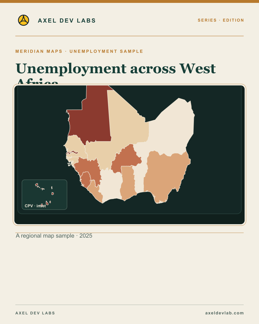
Unemployment across West Africa

Editorial content. This page contains the full editorial reading. Social media cards are separate promotional assets, shown in their own section.

Read the edition

Series · Publication day · Credits and sources

Unemployment by country · 2025

The development: Equal-count classes make relative positions easier to compare.

What the evidence says: National estimate; not a measure of job quality or informal employment.

Social media cards · separate promotional assets

Each link opens a social-ready card image, its platform caption and permanent post URL. These assets do not replace the editorial content above.
Adg Editorial Edition
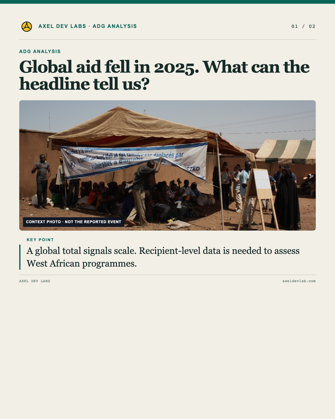
Global aid fell in 2025. What can the headline tell us?

Editorial content. This page contains the full editorial reading. Social media cards are separate promotional assets, shown in their own section.

Read the edition

Series · Publication day · Credits and sources

What the global aid estimate can—and cannot—tell us

The development: The global estimate signals scale; it cannot trace which West African programmes changed.

What the evidence says: ODA is measured across donors. Regional exposure requires recipient-level disbursement data; commitments and disbursements are different measures.

Question to watch: Which recipient-level changes are visible in final OECD data?

Social media cards · separate promotional assets

Each link opens a social-ready card image, its platform caption and permanent post URL. These assets do not replace the editorial content above.

Adg Editorial Edition
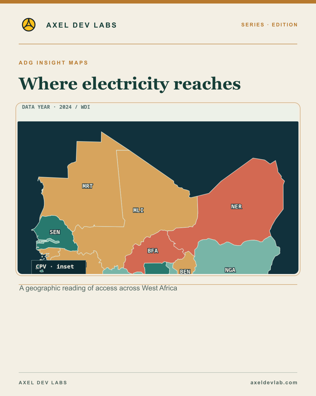
Where electricity reaches

Editorial content. This page contains the full editorial reading. Social media cards are separate promotional assets, shown in their own section.

Read the edition

Series · Publication day · Credits and sources

Electricity access varies.

The development: 16 / 16 countries · 2024

What the evidence says: Color encodes access rate, not policy success or cause.

Question to watch: Which countries share an access band?

Electricity access: two extremes.

The development: Niger 21.3% · Cabo Verde 98.4%

What the evidence says: 77.1 percentage-point range · 2024

Question to watch: What might explain the range without assuming a cause?

A national rate is not a local map.

The development: This figure describes the share of people with electricity access nationally. It cannot show which neighborhood or household is left out.

What the evidence says: Color encodes access rate, not policy success or cause.

Question to watch: What local evidence would test this national pattern?

Social media cards · separate promotional assets

Each link opens a social-ready card image, its platform caption and permanent post URL. These assets do not replace the editorial content above.

No results found

Try adjusting your search or filters.